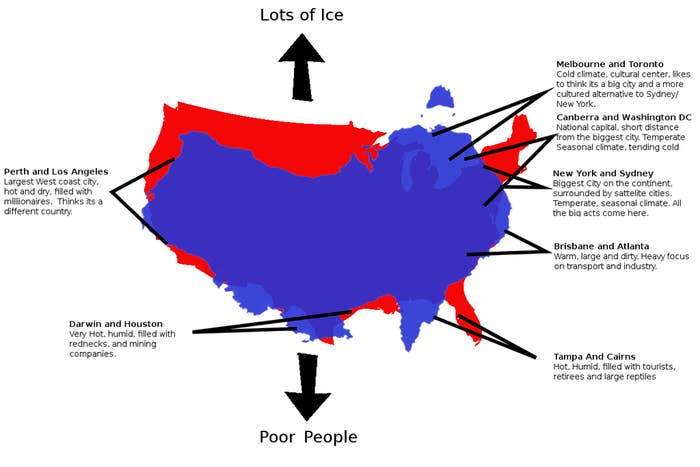
Here’s an interesting map. Someone flipped Australia upside down (to compensate for its location in the Southern Hemisphere), overlaid it on a map of the USA, and showed how much alike similarly-located cities are.
(By the way, “Separated at Perth” may be my new all-time favorite blog headline, replacing “Sweeping views of Broome” that I did a few years ago.)

Interesting comparison and a GREAT headline.